Create a custom Main method for WPF application

•January 8, 2009 • 4 Comments

When you create a new WPF Project the project template will create an App.xaml for you. Since WPF does a little magic behind the scenes, there is no way to access the Main method of your application. In this case, you simply delete the App.xaml and create a new App.cs class with the following code:

public class App : System.Windows.Application
    {
        public Application()
        {
            StartupUri = new Uri("Window1.xaml", UriKind.Relative);
        }

        [System.STAThreadAttribute()]
        [System.Diagnostics.DebuggerNonUserCodeAttribute()]
        [System.LoaderOptimization(LoaderOptimization.MultiDomainHost)]
        public static void Main()
        {
            Application app = new Application();
            EnsureApplicationResources();
            app.Run();
        }

private static void EnsureApplicationResources()
{

        // merge in your application resources

        Application.Current.Resources.MergedDictionaries.Add(

            Application.LoadComponent(

                new Uri("CustomAppTest;component/Resources/App.xaml",

                UriKind.Relative)) as ResourceDictionary);

    }

}

    }

http://blog.matthidinger.com/2008/10/12/Increase+AddIn+Performance+With+MAF+And+WPF+Using+LoaderOptimization.aspx

http://www.drwpf.com/blog/Home/tabid/36/EntryID/10/Default.aspx

How to use OpacityMask to make UIElement partly invisible

•December 16, 2008 • 1 Comment

<Button HorizontalAlignment=”Stretch” VerticalAlignment=”Stretch” Content=”Button”>
<Button.OpacityMask>
<LinearGradientBrush EndPoint=”0.5,1″ StartPoint=”0.5,0″>
<GradientStop Color=”#FF000000″ Offset=”0″/>
<GradientStop Color=”#FF000000″ Offset=”0.5″/>
<GradientStop Color=”#00000000″ Offset=”0.5″/>
</LinearGradientBrush>
</Button.OpacityMask>
</Button>

xml:lang in XAML

•December 13, 2008 • Leave a Comment

XAML xml:lang property

Notice the xml:lang placed at the root element of the XAML file. This property describes the culture of a given element and its children. This value is used by several features in WPF and should be changed appropriately during localization. This value changes what language dictionary is use to hyphenate and spell check words. It also affects the display of digits and how the font fallback system selects which font to use. Finally, the property affects the way numbers are displayed and the way texts written in complex scripts are shaped. The default value is “en-US”.

Pitfall with using triggers in Style and ControlTemplate

•December 12, 2008 • Leave a Comment

Using triggers, including datatriggers, in Style and ControlTemplate can be sometimes tricky. Check out the following two code snippets.

<Grid Background=”Red”>
<Grid.Style>
<Style TargetType=”{x:Type Grid}”>
<Style.Triggers>
<Trigger Property=”IsMouseOver” Value=”True”>
<Setter Property=”Background” Value=”Green”/>
</Trigger>
</Style.Triggers>
</Style>
</Grid.Style>
</Grid>

<Button Content=”Test” Foreground=”Red”>
<Button.Template>
<ControlTemplate TargetType=”{x:Type Button}”>
<Grid>
<ContentPresenter/>
</Grid>
<ControlTemplate.Triggers>
<Trigger Property=”IsMouseOver” Value=”True”>
<Setter Property=”Foreground” Value=”Green”/>
</Trigger>
</ControlTemplate.Triggers>
</ControlTemplate>
</Button.Template>
</Button>

Neither of them will work as expected, although they look fine. The reason here is that the property on the FrameworkElement overwrites the setters in Style or ControlTemplate, Therefore, any change caused by setters will not actually bring any change.  The following is the order in which WPF assign a value to a property.

1. The default value (as set by the FrameworkPropertyMetadata object)
2. The inherited value (if the FrameworkPropertyMetadata.Inherits flag is set and a value has been applied to an element somewhere up the containment hierarchy)
3. The value from a theme style (as discussed in Chapter 15)
4. The value from a project style (as discussed in Chapter 12)
5. The local value (in other words, a value you’ve set directly on this object using code or XAML)

To fix the above samples, the solution is quite as easy as the following

<Grid>
<Grid.Style>
<Style TargetType=”{x:Type Grid}”>
<Setter Property=”Background” Value=”Red”/>
<Style.Triggers>
<Trigger Property=”IsMouseOver” Value=”True”>
<Setter Property=”Background” Value=”Green”/>
</Trigger>
</Style.Triggers>
</Style>
</Grid.Style>
</Grid>

As you can see, instead directly assign a value to the property, use setter in Style, whoese value can be overrwritten when the trigger executes its setter.

Another solution is to use setters on higher level, with TargetName property targetting the element. See following.

<Button>
<Button.Template>
<ControlTemplate TargetType=”{x:Type Button}”>
<Grid>
<TextBlock x:Name=”textblock” Text=”Test” Foreground=”Red”/>
</Grid>
<ControlTemplate.Triggers>
<Trigger Property=”IsMouseOver” Value=”True”>
<Setter Property=”Foreground” TargetName=”textblock” Value=”Green”/>
</Trigger>
</ControlTemplate.Triggers>
</ControlTemplate>
</Button.Template>
</Button>

Be smart with data binding

•December 11, 2008 • Leave a Comment

WPF’s data binding is so sweet that it should not be tied to the use of merely binding the UI to the data. Generically speaking, as long as it is dependency property, it can be data-bound. So, here is another situation where you would want to use data binding as well.

Say, you want a property of a object to automatically update whenever its source changes. The very decent solution will be that you turn the target property to dependency property, and bind it to the source. To make the source able to notify the target of any change, you can either implement IPropertyChangeNotification, or wrap the source to a dependency property. In this way, the target property does not need any logic to keep itself updated.

So, next time you need to assign a value to a dependency property, make sure if you want its value to automatically update. If you do, now you know what you can also do.

One thing that needs to be paid attention to, though, is that you should remember to clear the bindings whenever the object is not needed any more. A good place to clear bindings is the Dispose method.

RoutedCommand Focus Scope

•November 9, 2008 • Leave a Comment

When you use RoutedCommand, the most important thing is to make sure that the command will route in the way you want, meaning that the command can find the commandbindng from which the corresponding action will be executed. However, although it also has routing capability, it routes somehow differently from RoutedEvent. Ernie pointed the possible problem when using RoutedCommand, and the solutions.

Apparently, while CommandTarget works fine in one target situation, FocusManager.IsFocusScope seems the only choice for multi-targets circumstance. Unfortunately, Ernie did not explain in detail how IsFocusScope works. Brian did the job. He said:

“Usually, a command invoker looks for a command binding between its own location in the visual tree and the root of the visual tree. If it finds one, the bound command handler will determine whether the command is enabled and will be called when the command is invoked. If the command is hooked up to a control inside a toolbar or menu (or, more generally, a container that sets FocusManager.IsFocusScope = true), then some additional logic runs that also looks along the visual tree path from the root to the focus element for a command binding.”

NOTE: It only works for the commands which check the focus status to decide CanExecute, such as Cut and Copy. For commands of other kinds, it is useless.

I believe the above quoted words can explain how it works in Ernie post.

How to stop flickering on Video by turning off AllowsTransparency

•November 9, 2008 • 1 Comment

If you need to put a Win32 video control, say a webcam, in WPF program, and you also need to put WPF controls over it, your only possiblity is to use Popup as the container for these controls, because Win32 controls always on the top of all the WPF controls(including adorners), regardless the Z order. The reason why Popup can “stay” over Win32 controls is that it actually spawn another independ window.

However, under the circumstance of current version of WPF, if you do not use popup carefully, it will always cause very annoying flicker over the video. This is because you probably set the AllowsTransparency property of Popup to true. Dr.WPF gave his understanding of this issue. Then I do not repeate again.

Turning off AllowsTransparency of Popup is easy. How about MenuItem, ComboBox, ContextMenu and Tooltip? They all have internal popup which has AllowsTransparency set to true by default, but in different ways.

For MenuItem and ComboBox, you need to retemplate them with custom control template within which you explicitly set AllowsTransparency of Popup to false.

For ContextMenu and Tooltip, it will be more difficult becaue you cannot find popup in their templates. Therefore, you neend another method to deal with it. You Zhong provides a mothed to traverse the visual tree to get the popup instance. Although in his post, he did not directly address this issue, the method he came up with can certainly help. Here I quoted the two methods which are most important.

 private static void SetAllowsTransparencyInternal(Control element, Object value)
    {
        ToolTip tooTip = element as ToolTip;
        ContextMenu contextMenu = element as ContextMenu;

        // Set the IsOpen property to true to let the ToolTip/ContextMenu create Popup instance early, since
        // we are only interesting in Popup.AllowsTransparency property rather than
        // opening the ToolTip/ContextMenu, set its Visibility to Collapsed.
        element.Visibility = Visibility.Collapsed;
        if (tooTip != null)
        {
            tooTip.IsOpen = true;
        }
        else if (contextMenu != null)
        {
            contextMenu.IsOpen = true;
        }

        //Find the Popup logical element root.
        Popup popup = GetPopupFromVisualChild(element);
        if (popup != null) popup.SetValue(Popup.AllowsTransparencyProperty, value);

        //Set properties back to what it is initially.
        if (tooTip != null)
        {
            tooTip.ClearValue(ToolTip.IsOpenProperty);
        }
        else if (contextMenu != null)
        {
            contextMenu.ClearValue(ToolTip.IsOpenProperty);
        }
        element.ClearValue(FrameworkElement.VisibilityProperty);
    }

    private static Popup GetPopupFromVisualChild(Visual child)
    {
        Visual parent = child;
        FrameworkElement visualRoot = null;

        //Traverse the visual tree up to find the PopupRoot instance.
        while (parent != null)
        {
            visualRoot = parent as FrameworkElement;
            parent = VisualTreeHelper.GetParent(parent) as Visual;
        }

        Popup popup = null;

        // Examine the PopupRoot's logical parent to get the Popup instance.
        // This might break in the future since it relies on the internal implementation of Popup's element tree.
        if (visualRoot != null)
        {
            popup = visualRoot.Parent as Popup;
        }

        return popup;
    }

Z-Order

•October 31, 2008 • Leave a Comment

Z-order

In a WPF user interface, you can change the z-order of elements to control overlapping behavior. A hosted Windows Forms control is drawn in a separate HWND, so it is always drawn on top of WPF elements.

A hosted Windows Forms control is also drawn on top of any Adorner elements.

Refrence : http://msdn2.microsoft.com/en-us/library/ms744952.aspx

http://social.msdn.microsoft.com/forums/en-US/wpf/thread/0cfdf58e-e32b-44f0-a0fc-d846d91452d6/

Relations between Adorner, AdornerLayer and AdornerDecorator

•October 19, 2008 • 2 Comments

I read this article about Adorner. I’d like to make a note to make some concepts more straightforward.

Adorner
This is a base Adorner from which you will need to subclass.

AdornerLayer
The AdornerLayer can be considered as a plane in which the Adorners are drawn. Adorners are rendered in an AdornerLayer, which is a rendering surface that is always on top of the adorned element or a collection of adorned elements. Anything placed in the adorner layer is rendered on top of the rest visual elements. In other words, adorners are always visually on top and cannot be overridden using z-order.

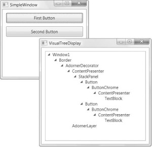
AdornerDecorator
Defines the location of an AdornerLayer in visual tree . Window class already has it in the visual tree. It adds the default adorner layer above all other controls in the window.

The workflow is actually quite simple.

AdornerDecorator generates AdornerLayer at where it is in the visual tree. An AdornerDecorator can contain only one child, which is the parent element for the visual tree below the AdornerDecorator. AdornerDecorator divides a visual tree in two parallel branches one of which is the child of the AdornerDecorator with it’s visual subtree, and the other one is AdornerLayer, like the figure below.
Adorning a Single UIElement

To bind an adorner to a particular UIElement, follow these steps:

  • Call the static method GetAdornerLayer of the AdornerLayer class to get an AdornerLayer object for the UIElement to be adorned. GetAdornerLayer walks up the visual tree, starting at the specified UIElement, and returns the first adorner layer it found. (If no adorner layers are found, the method returns null.)
  • Create new instance of the adorner you need and pass it the instance of the UIElement you need to adorn.
  • Call the Add method of the AdornerLayer, and pass it your newly created adorner to bind it to the target UIElement.

The following example binds  SomeAdorner (our own Adorner) to a TextBox named myTextBox.

myAdornerLayer = AdornerLayer.GetAdornerLayer(myTextBox);
myAdornerLayer.Add(new SomeAdorner(myTextBox));

Adorning the Children of a Panel

To bind an adorner to the children of a Panel, follow these steps:

1. Call the static method GetAdornerLayer to find an adorner layer for the element children of which are to be adorned.
2. Enumerate the children of the parent element and call the Add method to bind an adorner to each child element.

The following example binds a SomeAdorner (our own Adorne) to the children of a StackPanel named myStackPanel.

foreach (UIElement toAdorn in myStackPanel.Children)
myAdornerLayer.Add(new SomeAdorner(toAdorn));

Another thing worth of reminding is Validation.ErrorTemplate is rendered on AdornerLayer. So if you want your error template displayed, do not forget to give it a AdornerLayer, like what Karl does, or what Pavan does if you want your DnD works.

To quickly pick up Adorner, this article is probably a good start.

Update: although you can put an AdornerDecorator in XAML to let WPF itself create the AdornerLayer, you can also write code to do the job.

AdornerDecorator decorator = new AdornerDecorator();

decorator.Child = panel;

this.Content = decorator;

AdornerLayer layer = AdornerLayer.GetAdornerLayer(panel);

ControlTemplate and DataTemplate

•October 13, 2008 • 1 Comment

Sometimes it seems that some elements can be placed in the ControlTemplate, and also can be placed in the DataTemplate. This causes great confustion for WPF beginners. But actually there is a clear line between the both, and it is not that some elements can be placed in either of them.

ControlTemplate reflects the behaviors and appearance of a control. It should not have knowledge of the content(data), if it has, because the data is wrapped and represented by ContentPresenter/ItemsPresenter in the ControlTemplate.

DataTemplate is the representation of the data. Similarly, DataTemplate should not have knowledge of its residing control, because DataTemplate only represents the data, and can be placed in any ContentControl.

Karl said :”When authoring your control, attempt to design a control that derives its behavior and appearance from its own dependency properties.” This means that dependencyproperty is designed for its control’s behaviors and apperance, NOT for its content(data)’s behaviors and apperance. All the dependencyproperty-related behaviors and appearance should be defined in the ControlTemplate, whereas all the data-related behaviors and appearance should be defined in the DataTemplate. Note: By Data here I mean Content’s data.

This actually makes up a rule for the default ControlTemplate of the custom control:
When working on the default ControlTemplate for the custom control, do NOT involve DataTemplate,
because you do not know what the content(data) will be and how it will be represented. The content(data) is just abstracted as ContentPresenter/ItemsPresenter in the ControlTemplate.